Visualizing Swiss sustainability research
Over the last weekend, I participated in the SDG Hackathon organized by CorrelAid and the University of Basel.
The goal of the hackathon is to visualize how research happening in Switzerland addresses the 17 Sustainable Development Goals (SDGs) set up by the United Nations. Hackathon participants are provided with a public database processed by the text2sdg software. This dataset contains various types of information on research projects funded by the Swiss National Science Foundation, including each project’s number, title, keywords, university, and its corresponding SDG (judged by the text2sdg software).
Below is the visualization that I made (modulo minor post-hackathon adjustments):
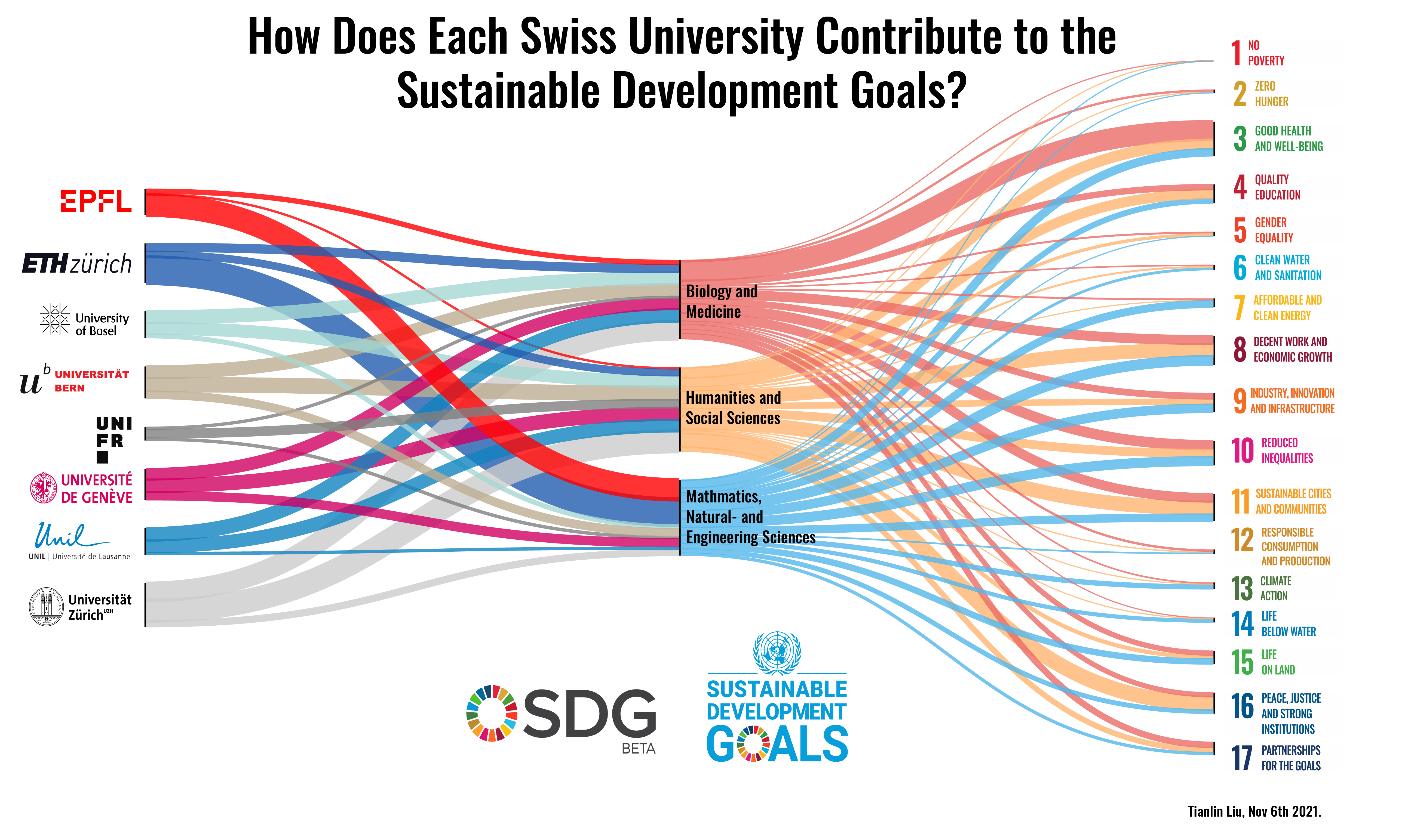
It is an Alluvial diagram that illustrates the number of projects broken down by universities, disciplines, and SDGs.
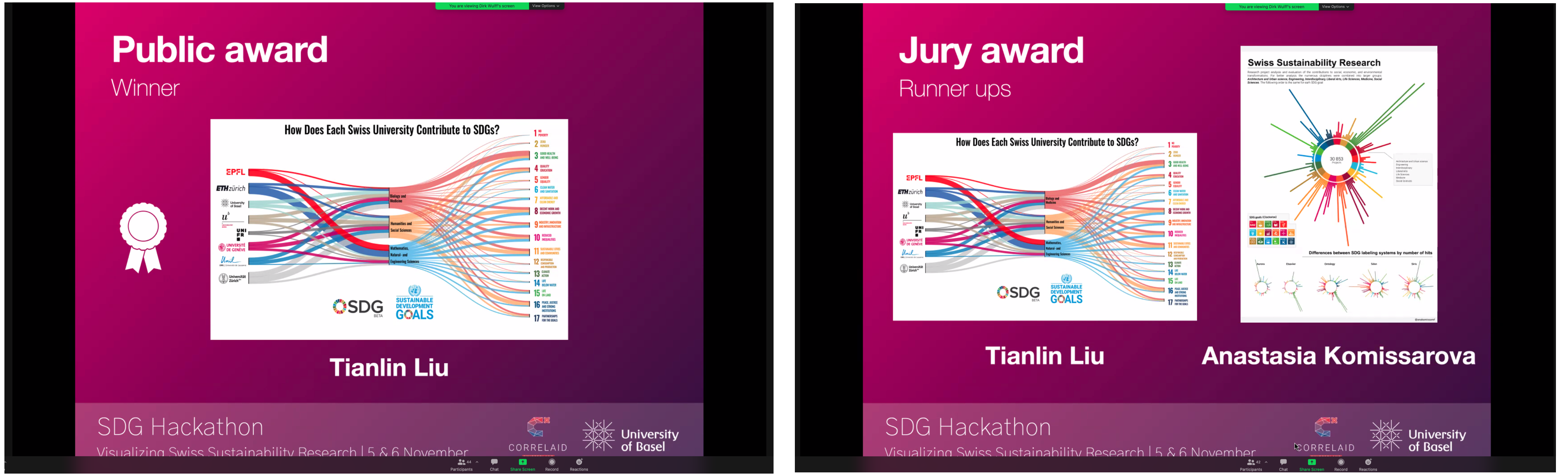
To my pleasant surprise, I won the public award and a runner-up jury award.
The pipeline for producing the figure was standard: I used Python, RAWGraphs, and Adobe Illustrator to generate the figure. Based on the hackathon repository on Github, I used the following code to pre-process the provided datasets sdg_hackathon_data.zip and supplementary_data.zip :
import pandas as pd
import numpy as np

main_df = pd.read_csv("sdg_hackathon_data.zip")
additional_df = pd.read_csv("supplementary_data.zip")

#join on main dataset
main_df = main_df.merge(additional_df, left_on = "project_number", right_on = "project_number", how = "left")

# only use ontology for query
query_df = main_df[main_df['system'] == 'ontology']

query_df = query_df.drop(columns = ['project_title', 'keywords', 'start_date', 'end_date', 'approved_amount', 'responsible_applicant', 'institution', 'abstract', 'discipline_number', 'project_number', 'hits', 'funding_instrument', 'abstract_translated_indicator', 'funding_instrument_hierarchy', 'system', 'all_disciplines'])


country = 'Switzerland'
country_data = query_df[query_df['institution_country'] == country]
country_data = query_df[ query_df.discipline_name_hierarchy.notnull()]


swiss_uni_list = [
 'University of Fribourg - FR',
 'ETH Zurich - ETHZ',
 'University of Zurich - ZH',
 'University of Geneva - GE',
 'University of Berne - BE',
 'EPF Lausanne - EPFL',
 'University of Lausanne - LA',
 'University of Basel - BS']

country_data = country_data[country_data['university'].isin(swiss_uni_list)]
country_data['discipline_name_hierarchy'] = [a.split(';')[0] for a in country_data['discipline_name_hierarchy'].to_list()]
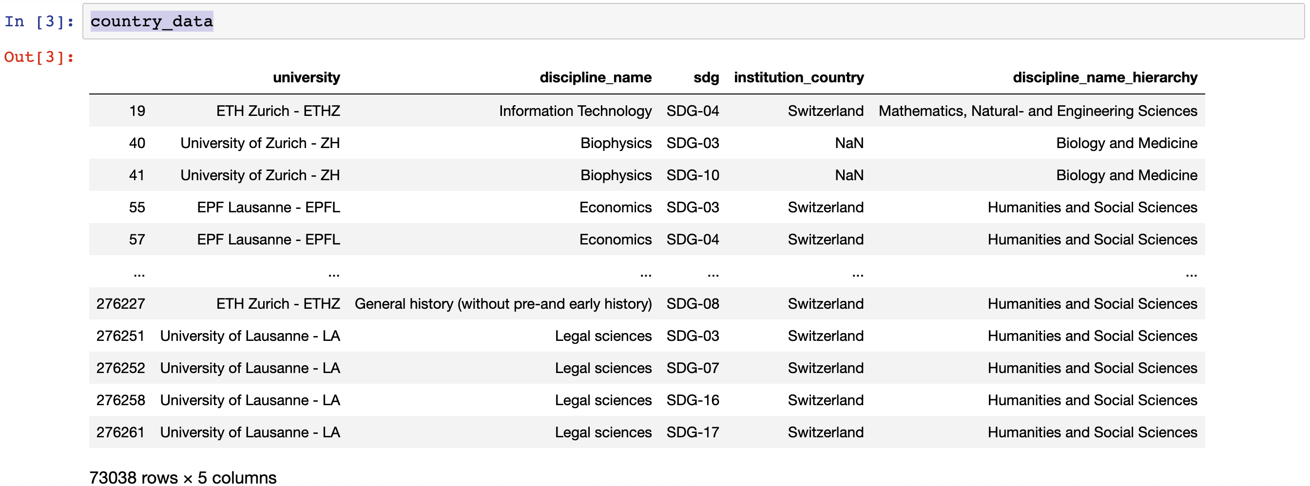
The pre-processed data country_data is a panda dataframe of the following form:
I then saved the country_data into a CSV file and uploaded it to RAWGraphs for a speedy visualization.
To choose colors for mappings between universities and disciplines, I have attempted to find the “main color” of each university: For the University of Basel, I used the Unibas Mint; for ETH, I used its official ETH blue; for EPFL, I used the Swiss red. For universities that do not have an official color, I chose colors based on their logos and webpages. For the mappings between disciplines and SDGs, I used three primary colors selected from the color-hex webpage.
As a next step, I post-processed the SVG figure generated from RAWGraphs using Adobe Illustrator. To make the text font consistent with those of the SDG icons, I used the Oswald font, which is recommended for the typography of SDG icons.
And that’s it! It took me about a day to generate and polish the figure.
Overall, the Hackathon was a fun experience! I learned a lot about data visualization skills such as how to use Adobe Illustrator to beautify vector graphics. A thank goes to Yue Kris Wu, who helped me improve the color palette used in the figure (by pointing out color-hex to me).